FSPW: Same mission, new logo
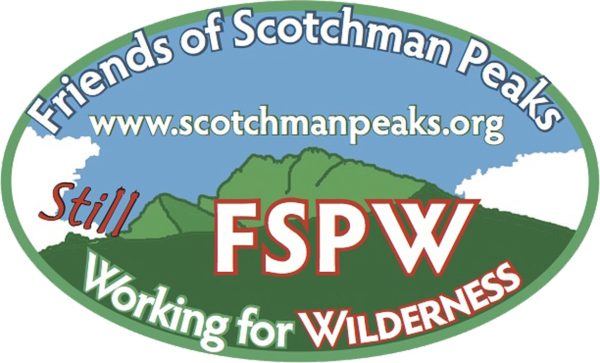
In part to symbolize a continued commitment to achieving wilderness designation for the Scotchman Peaks of Idaho and Montana, Friends of Scotchman Peaks Wilderness today announced the adoption of a new logo. The new logo contains a profile of the namesake peak backed by a blue sky and white clouds, emulating a scene often observed in the area surrounding the mountain.
“We’ve talked about a redesign for quite a while,” said FSPW executive director Phil Hough, “and our media guy (program coordinator Sandy Compton) came up with one that was a big departure from the old, with more color and a very recognizable graphic element.”
The goat is gone, but not forgotten. “The original logo with the goat and stylized mountains was designed by Jared Johnston of Selle Design Group,” said Compton. “It has been a good symbol for us, but we thought it was a good time to do a little ‘rebranding’ as a sign of our determination to stay the course.”
With a small organization like FSPW, it’s impossible to switch symbols completely and instantaneously, so both old and new will coexist for some time. “Who knows,” said Compton, “the goat might come to visit from time to time in the future. We’ll hold him in reserve. His image can be inserted into the new logo whenever we wish, and he will be making cameo appearances, for sure. After all, a number of our supporters have suggested the tag line ‘Don’t give up the goat!’ ”