Schweitzer debuts new logo, wordmark
▶️ Listen to this article now.
SANDPOINT — Schweitzer is debuting a new logo and wordmark.
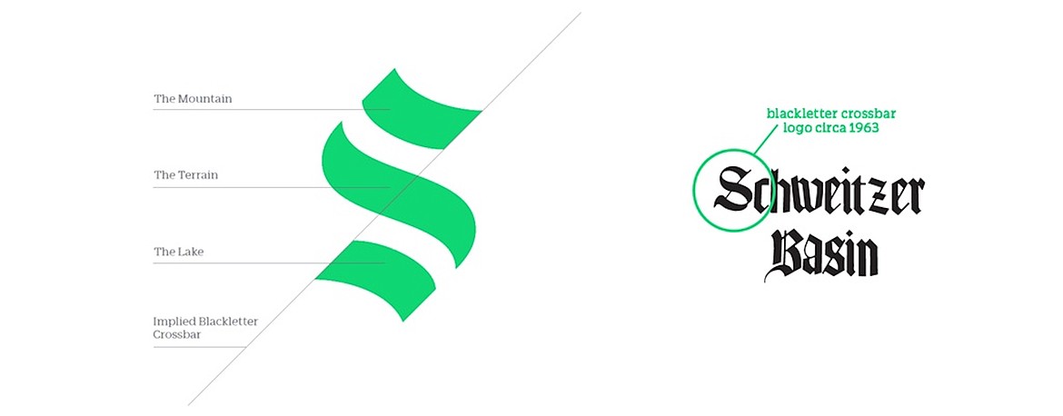
The resort said its new logo gives a nod to its past while embracing its future. It features an "S" that consists of three balanced and symmetrical strokes which are aligned on a 45-degree angle.
The resort said its new logo is recalls the gothic blackletter crossbar of Schweitzer's original logo from 1963 and is meant to reflect the physical influences on the resort — the peak of Schweitzer's summit, flowing terrain and its natural complement below, Lake Pend Oreille.
"The logo is the most recognizable element of our brand and is created to imply history and the back-and-forth motion of descending a mountain," Schweitzer said in its re-branding announcement.
Schweitzer said its primary brand color — green — is based on its enduring connection to the environment, while secondary brand colors — yellow and orange — are inspired by the dynamic hues used in a wide range of outdoor apparel, from retro ski outfits to more modern mountain bike clothing and accessories.
"These colors match the spirit of our Schweitzer family — alive, vibrant and radiant," Schweitzer said in the announcement.
Schweitzer is also excising "mountain resort" from its name.
"People who know us call us by our first name, 'Schweitzer.' Nobody says, 'Hey, wanna hit Schweitzer Mountain tomorrow?' Or, 'Schweitzer Mountain Resort got dumped on with 7 inches of powder.' We don't want to talk that way either. Going forward, we are keeping it simple and shifting from 'Schweitzer Mountain Resort' to the much friendlier, 'Schweitzer,'" the resort said.
Schweitzer said the new logo, wordmark and colors will be integrated into its website, village way-finding system, advertising and across social media channels.
"With this redesign, we set out to retain all the elements that endeared our earliest customers to Schweitzer, while creating space for our brand to evolve. But rest assured, it's still us," Schweitzer said.
The rebranding effort has been met with mixed reviews on Facebook. Some posted messages of approval, while others posted messages criticizing the new logo as too similar to the Seattle Kraken National Hockey League team or the flag of a financial news publication.
Info: schweitzer.com


